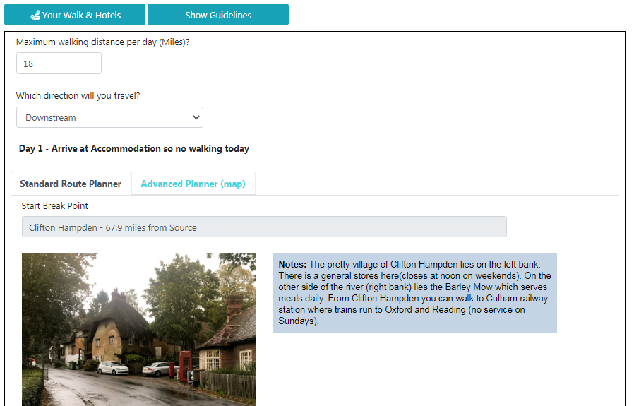
This morning we updated our Route Planner. Here are highlights of the changes:
We’ve changed the basic layout. Firstly, the default version is the “Standard Route Planner” which works using drop downs. The map version is renamed “Advanced Planner” and sits alongside. Remember you can toggle back between the two.
You’ll notice that the screen layout of the Standard Route Planner has changed with smaller images.
Also, if you look above, you’ll see a text box saying “Show Guidelines” which explains the process. A video is soon to be added.

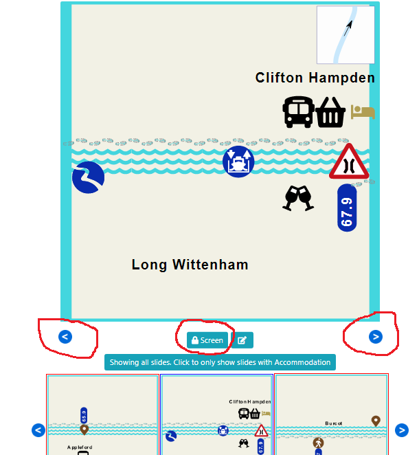
Following feedback from users, we have reduced the sensitivity of swipe functionality. This will stop users accidentally jumping to other pages.
It does mean that you have to swipe a little further. Or you can click on the new blue arrows to move back and forth.
For added measure, we have introduced a locking mechanism (see photo below). By clicking this you will not move from the page you are on.
We also reduced the number of mini-tiles below from five to three. These show your current tile as well as the two adjoining tiles. We felt the five tiles were too small to be of any use.
Whilst we’re on this page, and it’s not confined to mobile use, if you’re logged in you’ll see a note pad image next to the screen lock. By clicking on that you can send comments back to us on that page.

Hotels now appear with a yellow halo around them so that they can’t be missed. We had some feedback that they, especially the silver hotels, were not very obvious. They still turn to green when selected.
We have some new icons that are still to be deployed. We think this will make the maps easier to follow. These will be introduced gradually.
Do please send us feedback, both good and bad. We want this to be helpful to you.
Ready to book?
| Cookie | Duration | Description |
|---|---|---|
| cookielawinfo-checkbox-analytics | 11 months | This cookie is set by GDPR Cookie Consent plugin. The cookie is used to store the user consent for the cookies in the category "Analytics". |
| cookielawinfo-checkbox-functional | 11 months | The cookie is set by GDPR cookie consent to record the user consent for the cookies in the category "Functional". |
| cookielawinfo-checkbox-necessary | 11 months | This cookie is set by GDPR Cookie Consent plugin. The cookies is used to store the user consent for the cookies in the category "Necessary". |
| cookielawinfo-checkbox-others | 11 months | This cookie is set by GDPR Cookie Consent plugin. The cookie is used to store the user consent for the cookies in the category "Other. |
| cookielawinfo-checkbox-performance | 11 months | This cookie is set by GDPR Cookie Consent plugin. The cookie is used to store the user consent for the cookies in the category "Performance". |
| viewed_cookie_policy | 11 months | The cookie is set by the GDPR Cookie Consent plugin and is used to store whether or not user has consented to the use of cookies. It does not store any personal data. |